



🎨 Color Palette Generator
Algorithmic Color Theory with Smart Naming, History & Export
✨ Professional Edition • Smart Naming • Palette History • Advanced ExportHow many colours to pull out of that site — a maximum, not a quantity: a site may simply not use that many distinct colours, and pure white, black and common greys are skipped. This is not the “Palette Size” control further down the page: that one sets how many colours your own generated palette has. Changing one does not change the other, by design.
Generate a palette first to see UI preview
background: linear-gradient(135deg, #667eea 0%, #764ba2 100%);See how your palette appears to people with different types of color vision deficiency. ~8% of men and ~0.5% of women have some form of color blindness.
Generate a palette first to see color blindness simulation
Derive the dark-theme counterpart of your palette. This is not an inversion — backgrounds become near-black but never pure black, text lands short of pure white to avoid glare, and accents are desaturated and lightened, because a colour that looks confident on white buzzes on a dark surface. Every derived colour is then checked against the dark surface with the same contrast maths this tool sells, and lightened until it passes.
Compare your current palette against ones you generated earlier, scored by how many of their colour pairings actually pass. Swatches alone cannot answer the question you have when choosing between two palettes you both like — which one passes. Every foreground is tested against every background, not just against white.
Paste a client's existing brand colours. Unlike every other tab, these are fixed — the tool builds a system around them instead of adjusting them, then says plainly where the brand itself fails. Real brand palettes often do, and knowing before the client's lawyer does is the whole point.
Where a colour cannot carry text, “pick something else” is useless advice — so you get the closest colour that passes, measured with ΔE2000 rather than a naive RGB distance, and told how different it actually looks.
📊 Palette Size:
🎨 Color Harmony Type:
⚡ Industry Quick Start
📊 Palette Quality Score
Professional design analysis grading palettes on readability, role-appropriateness, balance, and usability.
Note: Our algorithmically generated suggestions score 100/100 - showing you the gold standard for comparison with uploaded or custom palettes
💡 Why This Is Perfect
- 🏆 PERFECT SCORE! This palette meets all professional design standards and best practices.
- ✅ Text colors are perfectly legible on white backgrounds
- ✅ Colors are optimally matched to their intended roles
- ✅ Excellent balance of light, medium, and dark shades
- ✅ Perfect mix of neutral and saturated colors for versatility
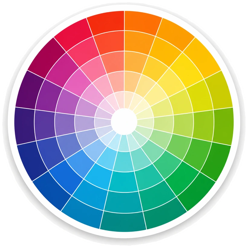
🎡 Interactive Color Wheel
Click anywhere on the wheel to pick a color • Hover to preview
🎨 Your Design System Palette
⚖️ Contrast Checker
Test contrast ratio between any two colors for WCAG compliance
Checking a real site and finding failures? Jedi Web Services fixes contrast and accessibility issues on client sites.
Preview Text
This is how your text will look with these colors.
🌈 Color Spectrum (Tints & Shades)
Full range of variations for your primary colors - click any shade to copy
Primary Actions
Primary Hover
Accent
💡 Alternative Palette Suggestions
Based on your base color, here are alternative palettes for different goals
Accessibility Optimized
High contrast for maximum readability
Modern & Vibrant
Bold, saturated colors for impact
Soft & Harmonious
Analogous colors for smooth flow
🌓 Background Preview Gallery
See how your palette looks on different backgrounds - perfect for testing light/dark modes, print materials, and wall colors
☕ Enjoying This Design Tool?
If you enjoy this design tool, please consider supporting my work by buying me a cup of coffee.
Your support helps me create more free tools for designers and developers.
🔬 How It Works
Unlike AI-based tools that guess or use machine learning, our Color Palette Generator uses proven mathematical algorithms and color theory principles for scientifically accurate, reproducible results every time.
📐 Mathematical Algorithms
HSL (Hue, Saturation, Lightness) and RGB color space conversions using industry-standard formulas ensure precise color calculations.
🎨 Color Theory Rules
Complementary, triadic, analogous, and split-complementary schemes based on the traditional color wheel and centuries of design principles.
📚 Color Name Database
Comprehensive lookup tables with thousands of named colors, including HTML/CSS colors, X11 colors, and paint brand equivalents.
♿ WCAG Compliance
Real-time contrast ratio calculations using WCAG 2.1 formulas ensure your palettes meet AA and AAA accessibility standards.
🏆 Why Algorithmic > AI
- ✓ 100% Deterministic: Same input always produces same output - no randomness
- ✓ Scientifically Proven: Based on color theory used by designers for over 100 years
- ✓ Fast & Offline: No API calls, no server processing - instant results in your browser
- ✓ Privacy Focused: All processing happens locally - your colors never leave your device
- ✓ Fully Transparent: Every calculation can be verified and explained mathematically
The Only Color Palette Generator Built on Pure Mathematics & Color Science
No guesswork. No training data. No black boxes. Just proven algorithms that work the same way every time.
💚 Free to use right now.
Everything on this page works right now with no account, no email and no limits — every harmony, every palette size, all 15 export formats and the full WCAG + APCA contrast report. Paid plans add things that need an account or a server. Take what you need — no sign-up, no credit card, nothing to cancel.
- Unlimited palette generation
- All 6 harmonies & 4 palette sizes
- All 15 export formats — CSS, SCSS, Tailwind, Tailwind Scale, shadcn/OKLCH, Material 3, Bootstrap 5, JSON, Figma, Sketch, ASE, SVG, Swift, Android, PNG
- Full WCAG 2.1/2.2 + APCA compliance report
- Colour-blindness simulation
- Colour lock, gradients, image & camera palettes
- Everything in Free
- Unlimited cloud palette library, saved to your account
- White-label compliance reports — your name and logo
- Batch contrast audits across your whole library
- Shareable palette links
- Everything in Studio
- 5 seats on a shared workspace
- Multi-URL site audits in one report
- Dated report archive — the evidence trail
- API access
Paid plans are not live yet — join the waitlist and you will be told when they are, at the price shown here.
Found contrast problems on your own site?
83.9% of home pages fail WCAG contrast — the most common accessibility failure on the web, and it rose from 79.1% last year (WebAIM Million, 2026). We fix these on client sites, from a one-off audit to a full accessibility pass.
Talk to Jedi Web Services →Designed and developed by Neil Sargisian · © 2025-2026 Jedi Web Services